BOISE, Idaho — Three months after graduating high school in Blackfoot, I was off and away to college at the University of Utah. Driving back and forth between Blackfoot and Salt Lake City, I can remember that feeling of seeing the Utah/Idaho state line. For me, it was bittersweet, leaving the comforts of home in Idaho, but going to the freedoms of being on my own in Utah.
There is something about a state's welcome sign that can conjure up a certain feeling. Utah's state sign has the Delicate Arch, "Life Elevated" it says, which is something you look at and say, 'That's cool, adventurous.'
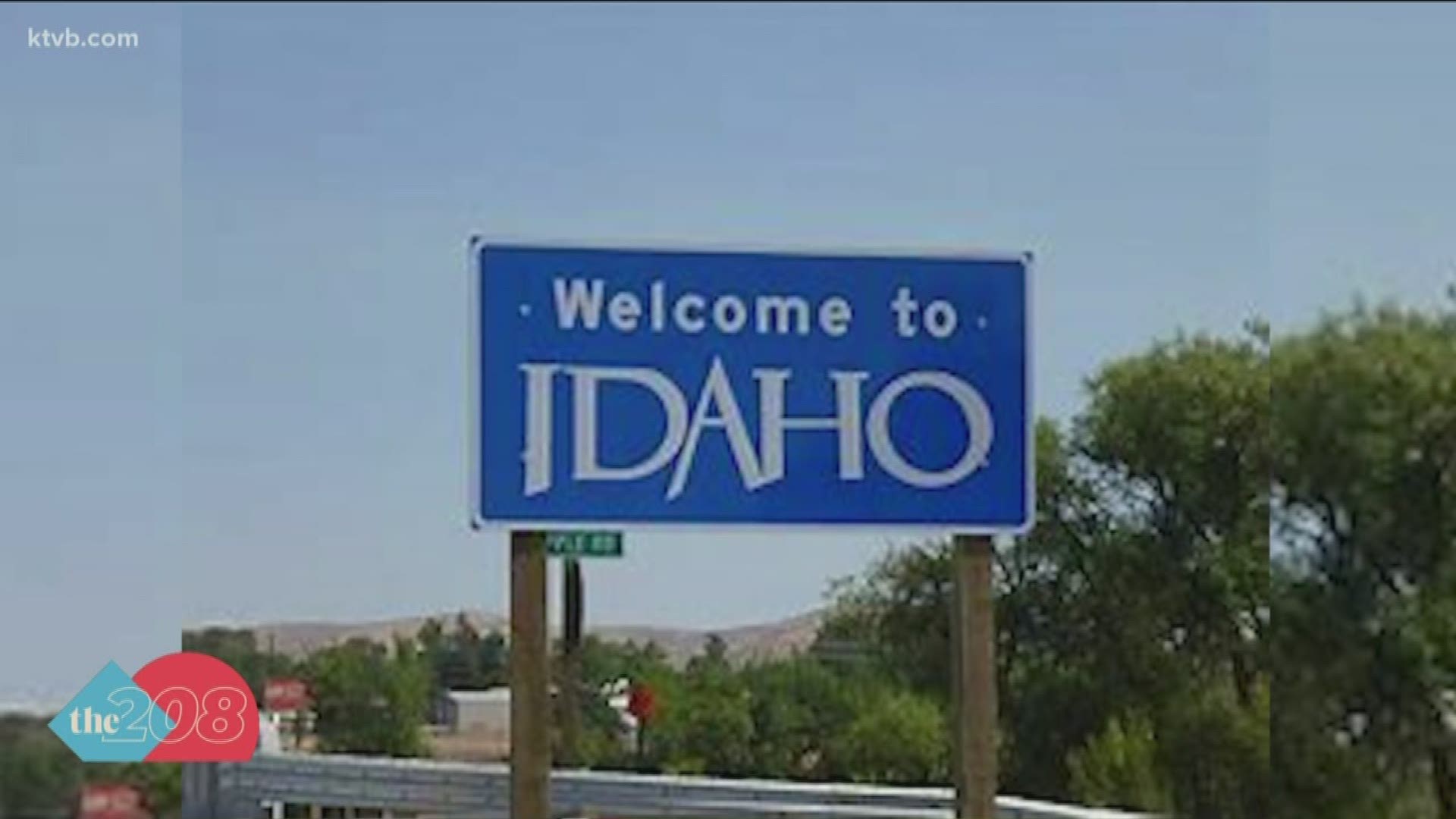
One of our viewers, Tracy, suggested that Idaho's sign, which simply says "Welcome to Idaho," could use some updating. But does it? It all depends on who you ask.
"Well, you know it's always going to be one of those things that your opinion may be different from one person to another," Jake Melder, the spokesperson for the Idaho Transportation Department, said.
"Beauty is in the eye of the beholder," he said. "So whether or not it could be a better design certainly is welcome for public debate."
Wyoming's welcome sign has its famous cowboy on it, in front of a picturesque, mountainous backdrop, while Oregon's has some trees on it and Washington chose to use their state outline on theirs. But Idaho's is just a sky blue sign with "Welcome to Idaho" on it, which is more functional than stylish.
"The sign that we have right now is both a form and a function, right. So the function that we need to keep up at the foremost is that it informs people that they've crossed over into the great state of Idaho," Melder said, "and there are standards that we must meet for safety sake so that the sign is legible so that it's not overly distracting so that people can still focus on the most important task when they're driving which is, of course, is driving."
In Montana, the state wanted to better brand its state, so Montana's Office of Tourism helped fund a project that would totally transform the state's signs along their borders.
For how Idaho should revamp their signs, Tracy has some thoughts for Idaho and suggested "a picture of the Sawtooth's or River of No Return." Which is unfortunately not likely with ITD's annual $400 million dollar shortfall.
"That's every single year, $400 million. And so when we look at our mission, your safety, your mobility, your economic opportunity, our priorities are going to fall along on investments that are going to forward those priorities," Melder said.
Unless Idaho tourism wants to step up like Montana's. Tourism is Idaho's third-largest industry, with 80% of people traveling by car and passing by our Welcome to Idaho sign.
"Maybe Idaho tourism would be interested in putting some skin into the game," Melder said.
RELATED: Have inalienable rights been taken away from Idahoans due to COVID-19 crisis mitigation efforts?
Join 'The 208' conversation:
- Text us at (208) 321-5614
- E-mail us at the208@ktvb.com
- Join our The 208 Facebook group: https://www.facebook.com/groups/the208KTVB/
- Follow us on Twitter: @the208KTVB or tweet #the208 and #SoIdaho
- Follow us on Instagram: @the208KTVB
- Bookmark our landing page: /the-208
- And we also turn each episode into a podcast on Spotify or Podbeam
- Still reading this list? We're on YouTube, too:

